


Anatomy of a page
Every component a post on this site can use, in one place: type, code, maths, tables, figures, notes and asides.
This page exists to be looked at. It exercises every piece of the reading
system so the design can be judged against real content rather than lorem
ipsum. Text is set in Figtree, numbers and code in JetBrains Mono, and
both share one x-height so inline code like Vec<u8> or O(n log n) never
bulges out of the linefont-size-adjust.const total = items.reduce((a, b) => a + b, 0). Keys look like
Ctrl + K, and a marked phrase stands out
without shouting. Links stay quiet until you need them.
Words
Body copy is the product, so everything else stays out of its way. A paragraph
holds roughly seventy characters per line; longer and the eye loses the next
line, shorter and it hops too often. Emphasis is italic, strong is
heavier, and deleted text is struck through.
Premature optimisation is the root of all evil, but premature abstraction is the root of all confusion.
— a note I left myself after a long refactor
A third-level heading
Third-level headings carry less weight and less space above them, so the outline stays legible at a glance.
And a fourth
Rarely needed, but available for reference material.
Lists
Unordered lists use a quiet dash:
- The page cache absorbs writes.
- The journal orders metadata.
- Ordered mode writes data before metadata.
- Writeback mode does not, and is faster.
- The disk cache lies, sometimes.
Ordered lists keep their numbers in the mono face:
- Parse the source into an mdast.
- Run mdast plugins: callouts, inline code, maths.
- Convert to hast and run figure, footnote and heading plugins.
- Serialise to HTML.
And a checklist:
- Reading column and rhythm
- Margin rail and notes
- Interactive figures
Code
Code blocks sit in a recessed well and widen beyond the text column when they need room. Titles, highlighted, inserted and deleted lines are all supported.
const targets = links.map((a) => document.getElementById(a.hash.slice(1)))
function active(line: number) {  let current = -1  for (const [i, target] of targets.entries()) {    if ((target?.getBoundingClientRect().top ?? Infinity) < line) current = i    else break  }  return current + 0  return current}
A terminal session gets its own frame:
bun run check && bun run build# 25 page(s) built in 2.31sLong files can fold their boring parts:
6 collapsed lines
use core::iter::Iterator;use x86_64::structures::paging::{ FrameAllocator, PhysFrame, Size4KiB,};use bootloader_api::info::{MemoryRegionKind, MemoryRegions};
pub struct BumpFrames<I: Iterator<Item = PhysFrame>> { frames: I,}
unsafe impl<I: Iterator<Item = PhysFrame>> FrameAllocator<Size4KiB> for BumpFrames<I> { fn allocate_frame(&mut self) -> Option<PhysFrame> { self.frames.next() }}Maths
Inline maths like sits on the baseline, and display maths breaks out of the column when it is wide:
Aligned derivations keep their equals signs in a column:
Tables
A small table stays as narrow as its content:
| Structure | Query | Update |
|---|---|---|
| Prefix sums | ||
| Fenwick tree | ||
| Segment tree |
Numbers align on the right so digits line up:
| Level | Latency | Size | Bandwidth |
|---|---|---|---|
| L1 | 1 ns | 64 KiB | 2 TB/s |
| L2 | 4 ns | 1 MiB | 1 TB/s |
| L3 | 12 ns | 32 MiB | 500 GB/s |
| DRAM | 80 ns | 64 GiB | 60 GB/s |
| NVMe | 20 µs | 2 TiB | 7 GB/s |
A wide table scrolls horizontally instead of squeezing:
| Model | Params | Layers | Heads | d_model | Context | Tokens | FLOPs | Year |
|---|---|---|---|---|---|---|---|---|
| tiny | 6.8M | 6 | 8 | 256 | 1024 | 0.6B | 2.4e16 | 2024 |
| small | 124M | 12 | 12 | 768 | 2048 | 10B | 7.4e18 | 2025 |
| medium | 350M | 24 | 16 | 1024 | 4096 | 26B | 5.5e19 | 2025 |
| large | 1.3B | 24 | 32 | 2048 | 8192 | 100B | 7.8e20 | 2026 |
Figures
Images are measured at build time and placed by their shape. A panorama runs edge to edge:

A landscape image takes the wide column:
A portrait image stays at text width so it never towers over the page:
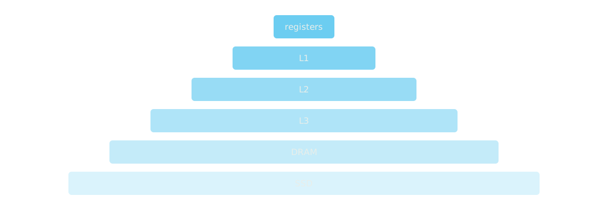
Vector diagrams work the same way:
Asides
Note
Notes add context the reader might want but does not need.
Tip (Measure first)
Profile before you optimise. The slow part is rarely where you think it is.
Warning
Benchmarks on a laptop on battery power measure the power governor.
Caution
fsync errors are not retryable on Linux; treat them as data loss.
Important (Read this)
Every number in this post is illustrative.
A collapsible digression
Sometimes a detail is worth keeping but not worth everyone’s time. This one explains that the page you are reading is generated from a single Markdown file.
That is everything a post can do with plain Markdown. Interactive figures
are one directive away::demo[caption]{is="element-name"} places a custom element from
src/demos in a figure and loads it lazily. See Fifty-two factorial.